Yozu
A transformative journey of rebranding and reinvention for Yozu.
Yozu recognised that its growth and evolution as a company required an updated brand and identity to better communicate its values, offering, and positioning to its target market. The rebranding process has helped the company to improve its online presence and digital marketing efforts, which was crucial for reaching and engaging with its target audience.
Yozu’s old brand only really took the visual elements into account, which is obviously important, but it felt a little too focused on style over substance, and didn’t do Yozu justice. Sporadic work was done in the past on various aspects such as tone of voice and values but we never looked to tie everything together to create one complete cohesive brand identity that really demonstrated who we are.
Research & Discovery
From the very start, we wanted the new brand to be authentic and meaningful. We knew how important it was to listen and learn from others and not only consider our own preferences. We ran a series of discovery and brand workshops with all key stakeholders to better understand what Yozu meant to them. We also undertook competitor and audience analysis, ensuring that the brand was commercially viable. Finally, worked to develop our brand archetypes; profiles that we could refer to when we wanted to quickly and accurately depict Yozu’s personality. We settled on two archetypes; the Sage and the Magician.
All of this work culminated in the creative direction and strategy for the new brand.

Outcome
This rebrand’s outcome is multifaceted and positively impacted the company’s reputation, customer engagement, market share, online presence, revenue, and employee morale.
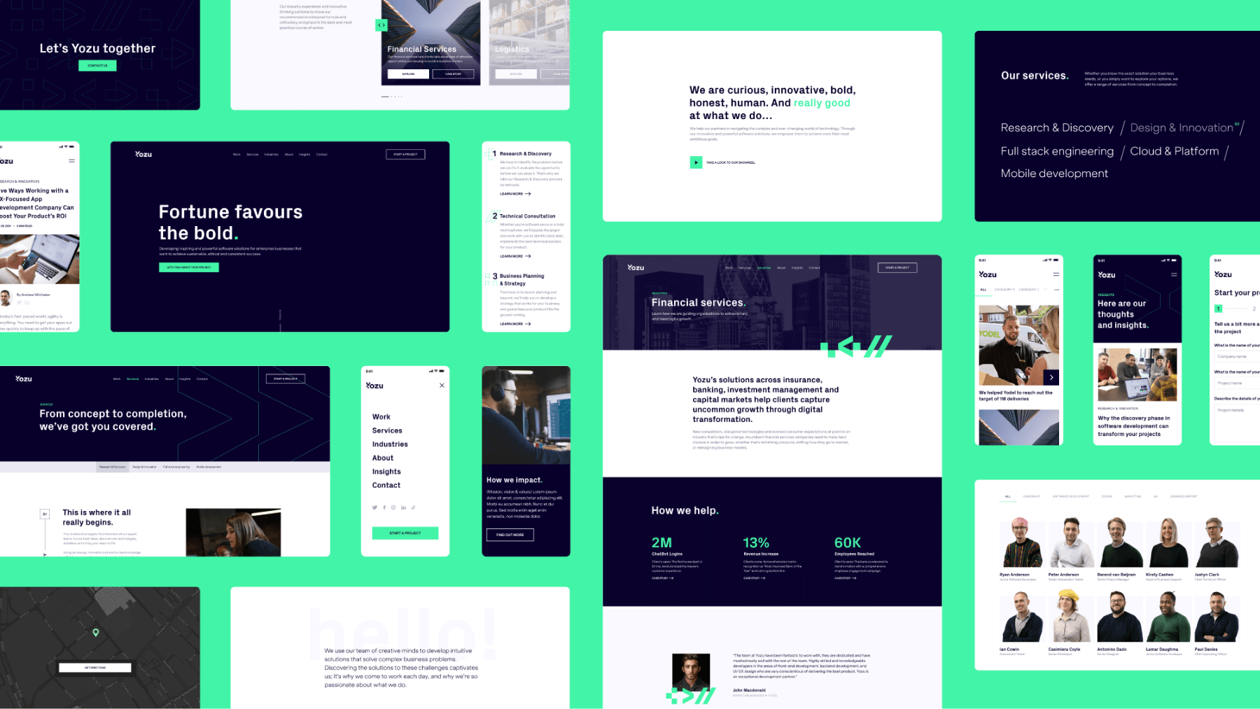
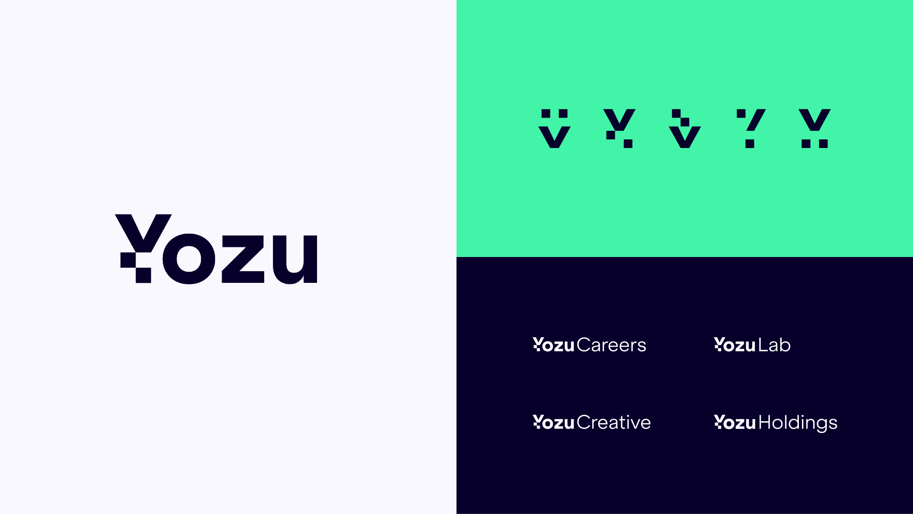
We created a well-rounded rebrand where everything is connected and consistent. The graphic system takes the new logo as inspiration, incorporating elements of it into graphical motifs. These motifs, when combined, result in a user-friendly and modular system that remains recognizable in all formats. They show how the brand speaks the same company’s language, the programming language.
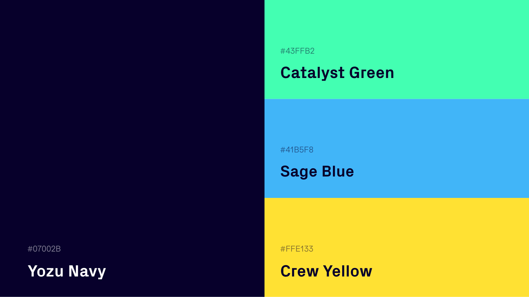
Along with the graphic system, Yozu changed its colours to differentiate the levels of hierarchy and sub-brands. While the primary colours are the dominant colours throughout the visual identity, the secondary colours have special use depending on the target audience.


