Oceans
Increasing conversions and promoting a sustainable eCommerce brand through thoughtful web design.
Following their recent rebrand, Oceans approached me and my team (as part of Yozu Creative) to produce a new eCommerce website which represents their new brand values, increases subscription conversions and gives them the ability to better manage their products and website as a whole.
The Challenge
We started the project by getting under the skin of Oceans’ offer and their competitors to fully understand their offering and redesigned brand language in order to design and develop a new eCommerce website. We created a new, clean, and moderised look and feel for the website, with a focus on clear customer journeys to better support their subscription service.

Research & Discovery
Our process began with an in-depth review, research, and analysis of all of the current customer journeys, pain points, and a review of how competitors handle similar problems. All of this information for the foundation for all of the decisions that were then made moving forwards.
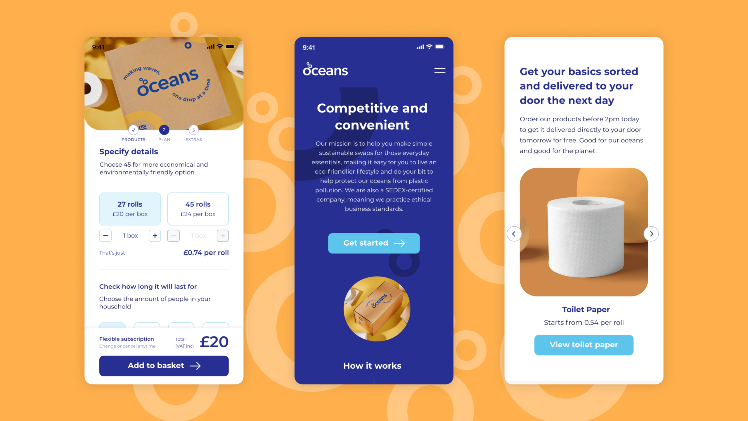
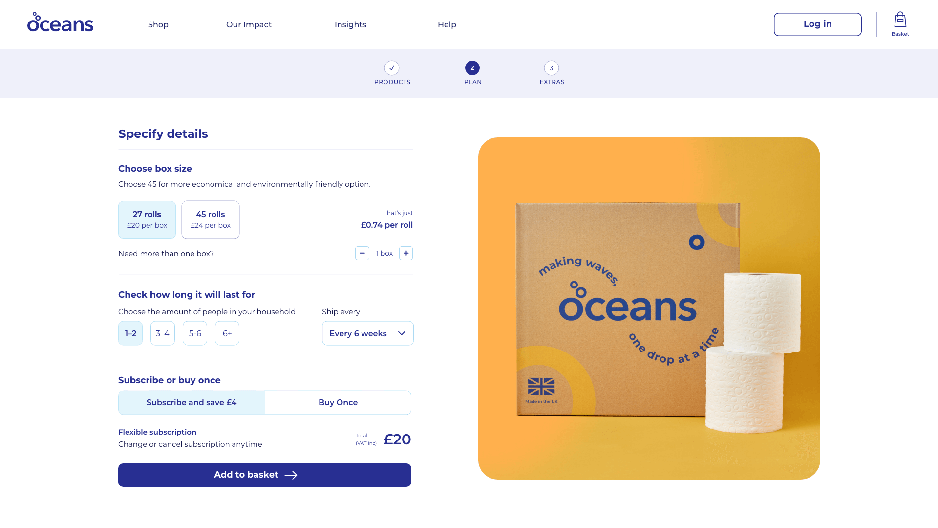
The main focus for the website — beyond a better look and feel — was the core purchase journey as this is where we found most of the websites issues stemmed from. The main challenge was making it clear what subscription a customer required due to the variety of pack sizes and options.
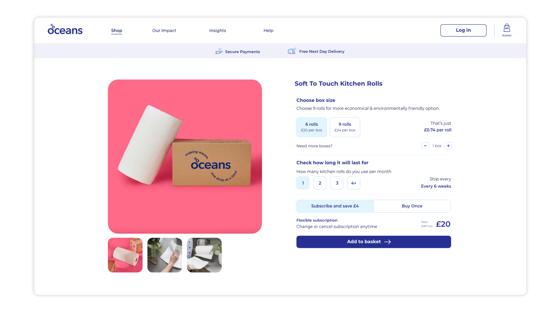
By designing a completely bespoke purchase journey that was tailored to Oceans’ product offering and made understanding product quantities and requirements as straightforward as possible we created a frictionless experience for customers.
The entire subscription process was thoroughly tested using methods such as user interviews and observation, as well as click tests — all handled via Lyssna (formerly Usability Hub).


Outcome
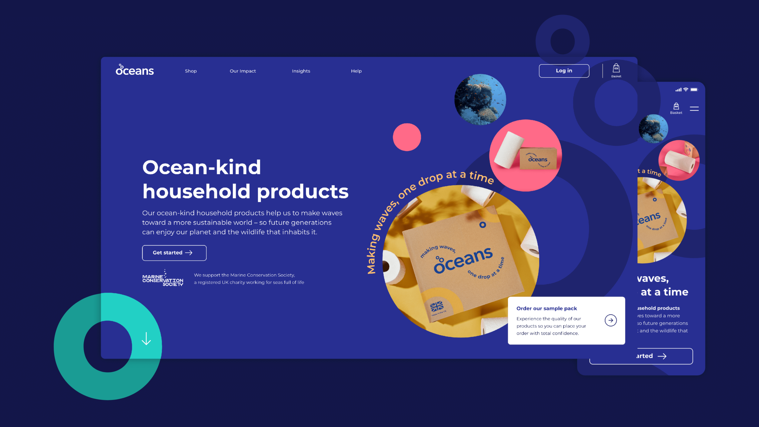
We created a clean website, to align with the Oceans product range aesthetic. While the client was open to design exploration, it was really important to emphasise the new brand elements, hence why we included a new range of colours and icons along with suggested branded product photography. We also emphasised the use of colour across their entire product offering by introducing a colour system, colour-coded imagery, and product elements (like backgrounds, coloured reviews or iconography).
The client is sustainable-focused, which is very close to our hearts. Within the overall design we promote caring for our environment by showing clean and healthy oceans.
Following the launch of Oceans’ new website, they saw incredible results across all of their key metrics, such as growing subscriptions by 80% and increasing conversion rates by 155%.
